
According to Coco Chanel, “The best colour in the whole world is the one that looks good on you.” Great advice, but how do you find it? I thought I knew the answer, but I was wrong. Until recently.
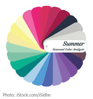
Over 20 years ago, when personal color analysis was in vogue and I “had my colors done”, I was told I was a Summer (which is a cool, muted palette). While attending a color analysis training session in February, I learned that the earlier consultation was incorrect: I am in fact a Warm Autumn, a palette with a golden undertone that is between Spring and Autumn.
So I’ve been wearing the wrong colors for all these years! This news was not trivial: as a woman who prides herself in looking her best whenever she leaves the house, I was shocked.
What is Personal Color Analysis?
Color analysis is the process of identifying the colors that will be most flattering to a person, based on her or his skin tone, natural hair color, and eye pattern. Suzanne Caygill first brought to the public’s attention the Seasonal System of Color Analysis in 1980 in her book Color: The Essence of You. When Carole Jackson’s Color Me Beautiful was published the same year, its popularity launched a whole new industry.
Many who had an analysis done in the early years were given inaccurate results. The original system categorized people into four seasons, based on the undertone of their skin. Those with a cool (blue) undertone were Winter or Summer; those with a warm (yellow) undertone were Autumn or Spring. Not everyone neatly fits into one of these categories. Over the years, the four seasonal palettes have been expanded into 16, to take into account the fact that many people have neutral (neither cool nor warm) skin undertones, and others have coloring characteristics common to more than one season.
Why Worry About Color?
Karen Brunger, a leader in the industry today, answers this question: “As an image consultant, I consider colour to be the most important element in having my clients appear their very best”. Experts agree that the colors we wear have the greatest impact on how we look and how confident we feel. When our clothing, jewelry, accessories, and makeup all harmonize with our natural coloring, our eyes sparkle and our skin looks flawless. The wrong colors make us look older: the jawline drops, and any imperfections in our complexion are emphasized.
The Palettes
Although there are 16 color palettes used by most analysts, I’m including only the four main seasons here, to illustrate the major differences.
Here are the warm palettes. Autumn has a gold undertone, with deep colors, while Spring’s light and bright colors have a yellow undertone.
 |

|
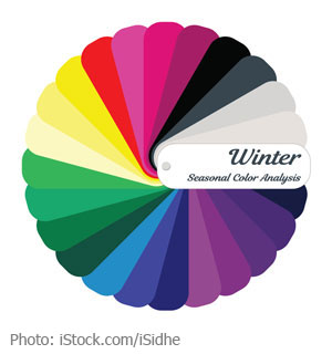
Both cool palettes have a blue undertone. Winter’s colors are vivid (high intensity), while Summer’s are muted (low intensity).
 |
 |
Putting the Guidelines into Practice
The color palette applies to everything we wear: clothing, accessories – including jewelry, shoes, and handbags – and make-up, including nail polish. It also applies to changes we make to our natural hair color. Fortunately, my colorist has been doing his job correctly, and my hair is fine. But my make-up needed to be changed – my eye shadow, mascara, and blush were cool, and my foundation was too warm. Once they were corrected, even I could see the difference.
As for clothing and shoes, the color wheels show to some extent where my wardrobe was before the training session (Summer), and where it needs to go (a warm palette between Autumn and Spring, with medium to high-intensity hues). I’ll be saying goodbye to blacks, grays, and most blues. At least I’ve always liked teal, brown, taupe, and emerald green, so I already have many items in my best colors. The biggest change will be the addition of hues such as rust, gold, and mustard – colors I've always liked but never expected to wear. And regardless of their presence in my palette, I won't wear hues that I don't like (pale orange, yellow, and yellow-greens).
Don’t think that I intend to toss a good portion of my wardrobe right now – who can afford to do that? The next few years will be a period of transition. I will phase out the colors that don't flatter me, incorporate scarves and jewelry to bring my best hues close to my face when I'm wearing something outside of my palette, and shop more wisely in the future. At this stage in my life, I have more clothes than I need anyway, so why not keep the ones that help me look my best?
And what about my jewelry? I moved away from yellow metals to white ones many years ago. But my palette book specifies yellow gold, brass, and copper, as well as creamy pearls and gemstones that match my recommended colors. Nevertheless, I will continue to wear my stainless steel watch and platinum rings because I love them. As for my costume jewelry collection, I’ll choose the jewelry to keep on the basis of the stone color rather than the metal.
4 comments
Thanks Barbara! It’s really helpful to read how personal color analysis has helped you develop your appearance and wardrobe. And well done to your colorist too! I provide customers with their palette of colors on an app for iPhone and iPad.
Thanks again,
Karen
Good advice!
Thanks, Patricia!
Good advice!
Leave a comment